 |
|||||||||
|
|
| ...Publications: Annual | ...Fresh | |||||||||||||||||||||||||
|
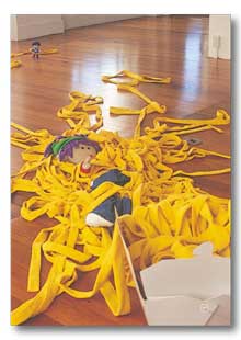
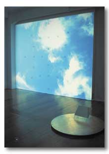
Fresh Continuing The Physics Room’s ongoing interest in supporting the practices of emerging and experimental artists, Fresh was a series which profiled the work of thirteen of New Zealand’s most exciting current practitioners. All recent graduates from arts institutions, both local and international, these artists draw on a vast terrain of medium and criticality’s, giving an overview of the diversity and depth of contemporary practice today. 13 - 24 DECEMBER 2000 A Winter Garden Dan Arps Untitled (summer show) Ella Reed Moat Eddie Clemens 21 FEBRUARY - 18 MARCH 2001 Epic (2) Melissa Laing Travel Stories VI: Otira/Germany - Schnittstelle/ InterfaceTime Capture Boxes: Otira Ina Johann Cineary Nathan Pohio 2 - 20 MAY 2001 Take Out (Sugar Takes Out Candy) Julaine Stephenson From Below Sera Jensen and Brendan Lee 22 AUGUST - 8 SEPTEMBER 2001 A Good Tradition Well Maintained Marcus Moore Risky Business Dane Mitchell Recreation Paula Collier Fresh: The smell of newly clipped grass. Phresh: Put that in your pipe and smoke it. Fresh: A series of eleven exhibitions held at The Physics Room between December 2000 and September 2001. Many elements of these shows have long since left my mind for greener pastures. My recollections consist primarily of my personal experiences with or around the shows or artists and musings from a distance on these events and how they may fit under the curatorial banner Fresh. The Physics Room press releases for Fresh announce that the series 'profiles the work of thirteen of New Zealand’s most exciting current practitioners. All recent graduates from arts institutions, both local and international, these artists draw on a vast terrain of medium and criticality’s, giving an overview of the diversity and depth of contemporary practice today.’ Very phresh of the Physics Room to say that the series would give an accurate ‘overview of the diversity and depth of contemporary practice’ when there was maybe one painting (Marcus Moore’s intimate watercolour of the Christ’s College zebra stripes), no performance (unless you count Eddie Clemens’ rescue effort on his show during the opening) and sod all photography. (For the converse reason, some might say the presence of printmaking in Fresh was rather baffling). The positive side of failure on the overview front is that various trends were well illustrated without being repetitive. Trends are all about being fresh, new and innovative, even when they do it in a retro kinda way. I think I want to say innovation requires trends, or trends come from innovation. Freshness is trendy. Always. It’s like there is a single overarching trend ‘freshness’, which is revisited every day, by every artist, in a fresh way. Sometimes it means looking at history and ripping it off. I’ve been reading Jorge Luis Borges and I’m kind of ripping him off, but I read him in a unique way and now this is coming out of me through a keyboard and eventually into you through a page or monitor in a particular way. And you might be drinking a coffee in your favourite cafe but not only that, they gave you too much change back and you’re going through the moral dilemma of whether to tell them or to just buy another coffee and hope it happens again. Or you’re at the Post Shop waiting in line, all you want to do is pay your phone bill and get out but the queue is massive and full of strange requests so you pick this yearbook out of your bag and here we are. The point is you are revisiting these shows in a totally unique and fresh way. Some smart bugger once said the only constant is change. God that coffee was good. Or maybe then it is all about degrees and intention of freshness, innovation and uniqueness. While every experience may be unique, the innovation quotient of brushing your teeth while listening to Madonna sing Like a Virgin may not be high, and your freshness will also be lower than it could be, if for instance, you were standing on your head at the same time. Anyway, the trends, or sub-trends of the global freshness movement which has been going since records began: Nathan Pohio did some video stuff in Cineary, (what a great name) darkened room and simulated cigarettes. Looked like a moving painting to me. A time based medium but used in a way that is narratively irrelevant but conceptually key. Involving the cigarette as a moment to reflect but here, the ‘time out’ is stretched to go for the duration of the show. A similar thing happened in Melissa Laing’s Epic (2) piece from the same series. It featured a video loop of the artist coming up toward us on an escalator from a tube station. The idea of travelling (to get somewhere) but never reaching the destination for some reason, in this case the looping of the video, recalls Groundhog Day but also perhaps modern life. Sera Jensen and Brendan Lee’s collaborative installation From Below used video projections to add texture and meaning. A beautiful Christchurch high cloud and blue sky loop provided the backdrop to a group of clocks incessantly ticking away, setting up a nice juxtaposition between humankind and the environment. The ‘loose’ scatter type, readymade installation was also well represented in the series. Dan Arps was first out of the gates with A Winter Garden featuring, among other things, plastic detritus courtesy of The Warehouse and the $2 Shop, carefully strewn throughout the front room of the gallery. Organised a bit like a city perhaps, complete with a paint-sniffing cherub. Second by a nose, Eddie Clemens’ show Moat had a similar loose feel about it. Shrink wrapped trays of plastic cups and rolls of toilet paper were stacked into various forms, knocked over and then restacked in an impromptu performance by the artist. The prominence of ready-mades in these shows, along with the loose scatter installation aided the temporary and reusable feel of the working parts. In fact I think Eddie may have been using those very same plastic cups from his show for the keg at his going away party (He moved to Auckland to do his masters at Elam). Reusing / recycling keeps the world fresh. This reusable feel contrasted with two other sprawling shows; Nathan Pohio’s Cineary and Julaine Stephenson’s TAKE OUT (Sugar Takes Out Candy), because they inversely featured made or worked objects which would be less useful for serving drinks in. A lot of the work also used humour for various effects. Dane Mitchell’s Risky Business was part freshman mischief, part playground scuffle gone big time. Basically young Dane stole some study notes and medication from the Gow-Langsford Gallery’s rubbish bag sitting out on the street and consequentially it all got out of hand. Marcus Moore’s A Good Tradition Well Maintained seemed to be at least partly taking the piss out of his own history from his choirboy days at Christ’s College, through to his recent forays into macho man kinetic art. Julaine Stephenson’s TAKE OUT was the second scene in a lurid walk-in 3D cartoon of sorts, featuring hip kids Sugar and Candy wearing the latest threads trying to rip each other to shreds. Dan Arps also pulled some schoolboy pranks in A Winter Garden, plastic flies on plastic shit. Somehow I found the paint-sniffing cherub pretty funny too. Ella Reed and Paula Collier both presented quiet shows, incorporating the gallery as an integral part of the work. In Reed’s Untitled (Summer Show), the gallery was taken generically as a location of a specific type of restrained behaviour. Healthy petunias hung in the window, a watering can sat on the floor, and visitors hovered around wondering if they could water the plants. Collier’s Recreation read as a response to the specific physical space and people flow of the Physics Room Gallery. A wall built up from sheets of glass, interspersed with slabs of wax, was evocative of snow and ice, ensuing that visitors were forced to change the way they negotiated the gallery. Both shows also looked very fresh: fresh flowers and fresh ice. Museum style aesthetics were employed in Mitchell’s Risky Business and Ina Johann’s Travel Stories VI: Otlira/Germany - Schnittstelle/Interface, Time Capture Boxes: Oblira. The display cases serve to aestheticise and add importance to what may otherwise be considered rubbish. They refresh the tired. The strength of the emotive arrangement of a child’s single gumboot in Johann’s show, is accentuated by its placement in a clinical display case. The museum style presentation in Risky Business prompts viewers to pay an obsessive attention to detail as encapsulated by Dane Mitchell. Truly phresh art should piss people off. So it is with some fondness that I remember the faint but ever present drone of Drummond devotees regurgitating dismay at the apparent absence of the artist’s hand in A Winter Garden over the first few weeks of the 2001 year at Ilam. There was a distinct lack of workshop effort and that pissed people off. However, that a show pisses people off does not constitute fresh or good art. That’s where ideas and techniques come in, and A Winter Garden, and the series as a whole, also featured a distinct lack of overworked clichéd ideas. Around the same time as fresh kicked off I remember saying something about (the Pauline Rhodes’s work) Ziggurat 2000 being sited in nature and getting a right bullocking from Arps who quite rightly pointed out that Hagley Park was a cultural site not a natural one. This nature vs culture theme rears its head again in A Winter Garden. Arps' installation introduced the technique of dumpster-diving into the series, a technique exemplified by Dane Mitchell. I was lucky enough to witness the discovery of one element in A Winter Garden one evening walking home from the Victoria St Fish and Chip shop chowing down on some crinkle cut chips with the artist, when he spotted a rather exquisite airbrushed impression of Christchurch landmark, the PriceWaterhouse building. I carried the chips home. This method of accumulating objects for exhibit has been going on for years but is still somewhat phresh when compared to the rather old-fashioned technique of paying for and working materials into a new form. December 2000 to September 2001. Seems like ages ago, and the fresh art of today is history tomorrow. Today’s innovations are tomorrow’s establishment. So Fresh: the series is history, and its fragments left in the minds of viewers will slowly fade. Lee Devenish This essay originally appeared in The Physics Room Annual
2001 Order your copy today from The
Physics Room ! Related
|
|||||||||||||||||||||||||
