 |
|||||||||
|
|
| ...PUBLICATIONS | ...HARDSELL!! | |||||||||||||||||||||||||||||||
|
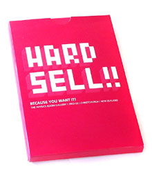
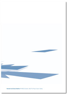
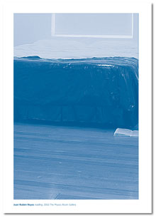
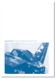
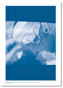
BECAUSE YOU WANT IT! Don’t be fooled by the terminology -for most of us, “hard sell” conjuresup a less than pretty picture. You might even go so far as to say it smacks of intimidation, of someone trying to sell something we wouldn’t buy unless we were talked into buying it. This is not the kind of hard sell I’m going to talk about here.1 Early drafts of a Creative New Zealand funding application for this series bore the name ****, a kind of marker or stake in the ground saying “ideas here soon”. Then, in a momentary fit of optimistic whimsy (fuelled, no doubt, by the late nights and caffeine writing the application demanded) the series became briefly Zoom, then, funding secured, metamorphosed into the somewhat cockier tag of HARDSELL!! Driven by the imperatives of capital letters, exclamation marks, and the by-line “because you want it” HARDSELL!! was never intended to have a subtle persona. HARDSELL!! attempted to be honest about the process of promoting and presenting the work of the nebulous group of artists sometimes identified as post emergent. It was a series which acknowledged the hype generated by galleries in creating that monster known in the art world as ‘the next big thing’, and the surrounding mechanisms of dealers, critics, collectors and audiences who devour each successive generation of next big things. HARDSELL!! was also a reference to the Physics Room’s place in the New Zealand arts community, as a publicly funded project space the Physics Room has remained a rare thing; a platform for experimental ideas and activities which exists outside (although necessarily feeds into and requires) the commercial aspect of the arts. As a space to play and develop, the Physics Room is able to offer artists a foray away from the confines of the hard sell. Pinpointing artists who have moved through (although not necessarily moved on from) artist run networks and are beginning to make a confident presence felt, HARDSELL!! was the result of an awareness that post emergent artists often have the opportunity to participate in group shows at a public gallery level, but that opportunities for developing a body of work for a solo show are limited. HARDSELL!! took an open approach to the thematics of a series, showcasing artists whose work seemed to represent a kind of spectrum of current artistic concerns and media, utilising technologies, language, sculpture, installation, audio, and design. There were numerous connection points between artists, not least of which was their confidence and ability to move with ease among media and categories. Of the eight artists featured in HARDSELL!!, all are building careers in other fields in addition to the visual arts, as designers, musicians, writers, lecturers. It is perhaps not coincidental that the HARDSELL!! artists move with familiarity between the worlds of art, fashion, commerce, and academia; their ease in a variety of settings is indicative of the way in which the role of the visual artist has moved away from the loner of high modernism, into a more integrated, aware persona which is connected and contributes to a wider community. In the arts as in other industries, the multitasking ‘portfolio person’ is carving out a diverse career for themselves. I want to talk about the honest hard sell. Techniques for grabbing attention. For confidently presenting the compelling benefits of an idea, a product, or a service. And for asking a prospect to take a specific action in their own self interest. The honest hard sell does not overstate the facts. It does not deceive. It does not intimidate. It deals with the truth. 2 The collaborative team of Hannah and Aaron Beehre source their images directly from the worlds of contemporary fashion and design -logos, posters, cute mangastyle creatures. Deceptively light and poppy, their work is designed to capture the immediacy of the moment, capturing the season’s look and colours, for, as they have previously said of their work “we sit back...and wait for them to date”. 3 For HARDSELL!! the pair created //PHY09.02, a screensaver for the discerning interface, writ large upon the gallery wall. Ubiquitous and insistent, screensavers are a user-friendly manifestation of the new and complex codes which script communication. Screensavers are also the visual equivalent of being put on hold. Like a drifting moving rave flier, the Beehre’s screensaver perpetually slides through a range of beautiful anonymous forms. Its very existence implies action, yet it is stuck on a treadmill of nothingness, looping endlessly into infinity. Slyly, within the apparent vacousness of this work and its latent familiarity to us as consumers, //PHY09.02 examined the visual trappings of late capitalism and the role of the internet as both possible perpetrator and saviour within such dialogue. Artist and interior designer Douglas Kelaher merges his own artistic practice with his skill as a designer and manufacturer to create detailed artificial environments which resemble film sets, or mock-up interior models for fictional corporations. However, turning this minimal mode of practice firmly on its head, Kelaher’s interactive sculptural work announced Don’t Stop Till You Get Enough, in a day-glo palette that positively screamed the eighties. To a soundtrack by the pop king himself Michael Jackson (in pre-surgery mode), visitors could whip Kelaher’s oversized wooden sculpture, “allowing audiences to vent all their frustrations with contemporary art and minimalism” as the press release optimistically put it. And vent they did, throughout the duration of the show visitors, often in large groups, would disappear into the darkness of the back gallery, and great sounds of thrashing and shrieking would emerge. By the show’s end the sculpture was pockmarked and scarred, rips and tears etched into its pristine surface. An unashamed crowd pleaser, this work was very funny, teetering on some invisible line between slapstick and provocation. Humour is also a familiar arrow in the bow of Mark Harvey, a performance artist whose background in contemporary dance perhaps explains a certain joy in theatricality and artifice in his practice. Often deploying the assistance of actors in his work, his large scale performances adroitly ape familiar cultural events but with a twist - such as a previous performance at the George Fraser Gallery where Harvey created a quasi night club, complete with bouncers and door queues, yet ultimately offering no entertainment. In the video work Open Home Hamper Harvey tackles that major rite of passage to adulthood - buying one’s first home. Grappling with the problem of how to decide if a particular house is the right one, (whether in fact, it could transform from a house to a home), Harvey takes a practice run in the garage of a suburban house which is on the market. We follow the artist via the lens of a head mounted camera, undergoing what he describes as “free associative play” 4 or the kind of nesting rituals one might undergo in such a situation. Or maybe not, the obsessive, uneasy sequence of actions he enacts taping objects together, moving paint rollers and tarps - seem weirdly displaced from the suburban nuclear dream he aspires to. Susan Ballard offered us a micro lens through which to view the world. An artist who works as a theorist and teacher, she has stated that she wants to discover the very organisms which surround us, the “not-quite invisible matter which we take for granted”.5 In Sensible, her photographic works focus in so closely on their floral subject as to render their imagery blurred beyond recognition. Flowers became so much larger than life they distorted into pixilation and colour saturation. In addition the gallery space was filled with the cloying scent of Glade floral ‘plug-ins’, overpowering the space to an almost unbearable degree with a smell which was physical. This was nature to excess, and a kind of interior, urban version of nature which was completely synthesised. Both Kathleen Peacock and Juan Rubén Reyes place language firmly at the heart of the visual experience. Reyes often takes the very materiality of language as his subject matter, the look, feel, shape of letters themselves, presenting text as beautiful significant objects in their own right. In the exhibition Reading however, Reyes moved beyond this focus on language to the experience of reading itself. A queen size bed was pushed into the rear of the room, covered with crisp white linen and voluptuous pillows, looking as unlike the abode of a starving writer in the garret as possible. Under each of the front legs propping up the bed sat a copy of Freud’s Civilisation and its Discontents, the ink of which could be seen to have leaked out from the books (overnight perhaps in a frenzy of engagement?) and crept up into the sheets, a sticky black stain oozing into all that whiteness. Freud’s problematic placement as the grand old master of modern psychology gave this simple diorama a more sinister edge, its (literally) black humour laced with possible readings. For Kathleen Peacock too language is as physical as it is conceptual, as the “rhythms of speech tick, beat, syncopate and throb” throughout her work.6 In recent text based pieces the artist has explored the art of conversation, often in the form of constructed dialogues between the artist herself and historical artworks or artists, such as the work Men Alone in Rooms - a Conversation with Francis Bacon (Centre for Contemporary Art, 2000) where the supposed conversation was presented in the form of a book script. Mouth to Mouth: A Phonetic Attraction saw the artist hanging a series of small orange boxes from the gallery walls, which spilled forth conversation in the form of paper fragments. Each box was a kind of ‘how to’ kit for dialogue, perhaps for those emergencies where only the right words will do. Tiny speakers inserted into larger white crates played further language cut-ups, texts from a variety of sources remixed and overlaid, building a cacophony of narrative upon narrative. The Andrew sisters were cheek to cheek with Focault, Cixous talked it over with ‘A Pocket Guide to Correct Punctuation’ - it was a veritable tower of babel, like the white noise of a party in full swing. Katharina Jaeger’s work gives a spin to inordinate objects, tweaking them out of familiarity into new and complex readings. The first work I ever saw of hers was a sleeping bag, beautifully upholstered from yellow plastic supermarket bags. The simple gesture was presented with quirkiness and a sense of the ridiculous. Similarly, her exhibition Lift for HARDSELL!! took the contents of her home and repositioned them throughout the gallery space, unified however, by the fact that each object - ironing board, table, TV, jug - was covered with a thin stocking-like gauze. With their individual surfaces removed, the shapes and form of the objects became clues, their identity not erased but blurred. Filling the gallery floor almost completely, the objects were accompanied by a low but piercing metallic audio by musician Peter Stapleton, which sounded like the noises objects might make when left in the house with no people around. In stark contrast, HACKER 1, Georgiana Morison’s exhibition of three video works, was subtle to the point of barely inhabiting the gallery. At points in this wall projection almost nothing was visible, yet the patient viewer was rewarded by works which were crisply intense. The first, Flush, was a seventeen minute piece filmed in an entirely white room, the camera moving almost imperceptibly, spanning the room again and again. Only at points where two corners met, or where a pillar jointed the room, were we aware that the camera was even shifting, the white on white compelling in its density and bleakness. A soundtrack of footsteps traversing the room could have been our own feet moving in time with the camera. The other two works, Et Cetera and in freespace, had more of a noisy presence about them. In Et Cetera the white wall has been covered by a trickle of water, then building to a veritable torrent, while the silhouette of a tree in the video in freespace stood stoically against a background hum which built to a chant-like roar. Hard sell copy doesn’t play games. We live in a world where seemingly everything is the ‘ultimate’ or the ‘best’. Unrealistic claims are a turnoff. Tell your audience the compelling benefits of your product, but don’t taint your copy with claims you wouldn’t believe yourself. 7 Emma Bugden 1.Excerpt from http://www.ideabook.com/hardsell/hardsell.htm This essay originally appeared in HARDSELL - the Catalogue The HARDSELL!! series: Juan Rubén Reyes
Order your copy today from The
Physics Room !
|
|||||||||||||||||||||||||||||||
